Easy Copy
DESIGN THE IDENTITY AND BRANDING OF AN ONLINE PRINTING SOLUTION.
DESIGN THE IDENTITY AND BRANDING OF AN ONLINE PRINTING SOLUTION.
_
EN
EN
Easy Copy was conceived by Stéphane Le Sech, creator of the physical PC Duo outlets, dedicated to the repair and sale of computer equipment. The idea behind Easy Copy? To create a network of partner printers around a digital online printing solution.
Through a dedicated website, a user can upload documents, print them in the nearest print shop, and pick them up once the printing is finished.
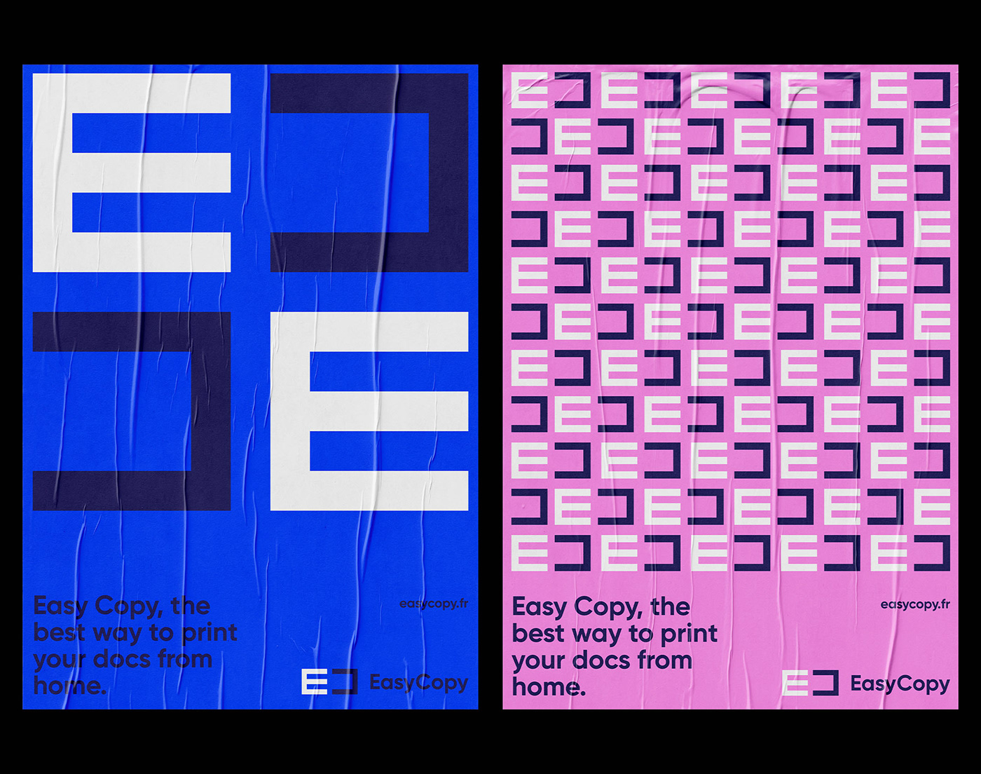
Palantis was mandated by Stéphane to think about the complete visual identity of the solution, as well as all the supports that would make the brand live through its graphic territory. We opted for a simple, geometric graphic signature, with a strong and sharp visual impact. The shape of the logo on the one hand, but also the choice of a bright color spectrum.
The Easy Copy logo is therefore a stylized "E" and "C". The "C" is deliberately inverted to create a visual symmetry. This echoes the promise of the solution which is dedicated to copying and printing documents. The logo thus becomes the central pivot of the identity. The basic element used to decline all the elements and communication supports, creating compositions based on geometric patterns.

Easy Copy
CONCEVOIR L’IDENTITÉ ET LA STRATÉGIE DE MARQUE D’UNE SOLUTION D’IMPRESSION EN LIGNE.
CONCEVOIR L’IDENTITÉ ET LA STRATÉGIE DE MARQUE D’UNE SOLUTION D’IMPRESSION EN LIGNE.
_
FR
FR
Easy Copy a été imaginée par Stéphane Le Sech, créateur des points de vente physiques PC Duo, dédiés au dépannage et à la vente de matériel informatique. L’idée d’Easy Copy ? Créer une un réseau d’imprimeurs partenaires autour d’une solution digitale d’impression en ligne.
À travers un site dédié, un utilisateur peut téléverser des documents, les imprimer dans le point d’impression le plus proche de chez lui à distance, et venir les récupérer une fois l’impression terminée.
Palantis a été mandatée par Stéphane afin de réfléchir à l’identité visuelle complète de la solution, ainsi qu’à l’ensemble des supports qui feraient vivre la marque à travers son territoire graphique. Nous avons opté pour une signature graphique simple, géométrique, avec néanmoins un impact visuel fort et tranchant. Par la forme du logo d’une part, mais aussi par le choix d’un spectre de couleurs vif.
Le logo d’Easy Copy est donc un “E” et “C” stylisés. Le “C” est volontairement inversé pour créer une symétrie visuelle. Celle-ci fait échos à la promesse de la solution qui est dédiée à la copie et l’impression de documents. Le logo devient donc le pivot central de l’identité. L’élément de base utilisé pour décliner l’ensemble des éléments et supports de communication, créant ainsi des compositions à base de patterns géométriques.